Session 2
Topics
- Plotting continuous data vs continuous data
- Manipulating aesthetics
- Mapping data to aesthetics
Plotting continuous data vs continuous data
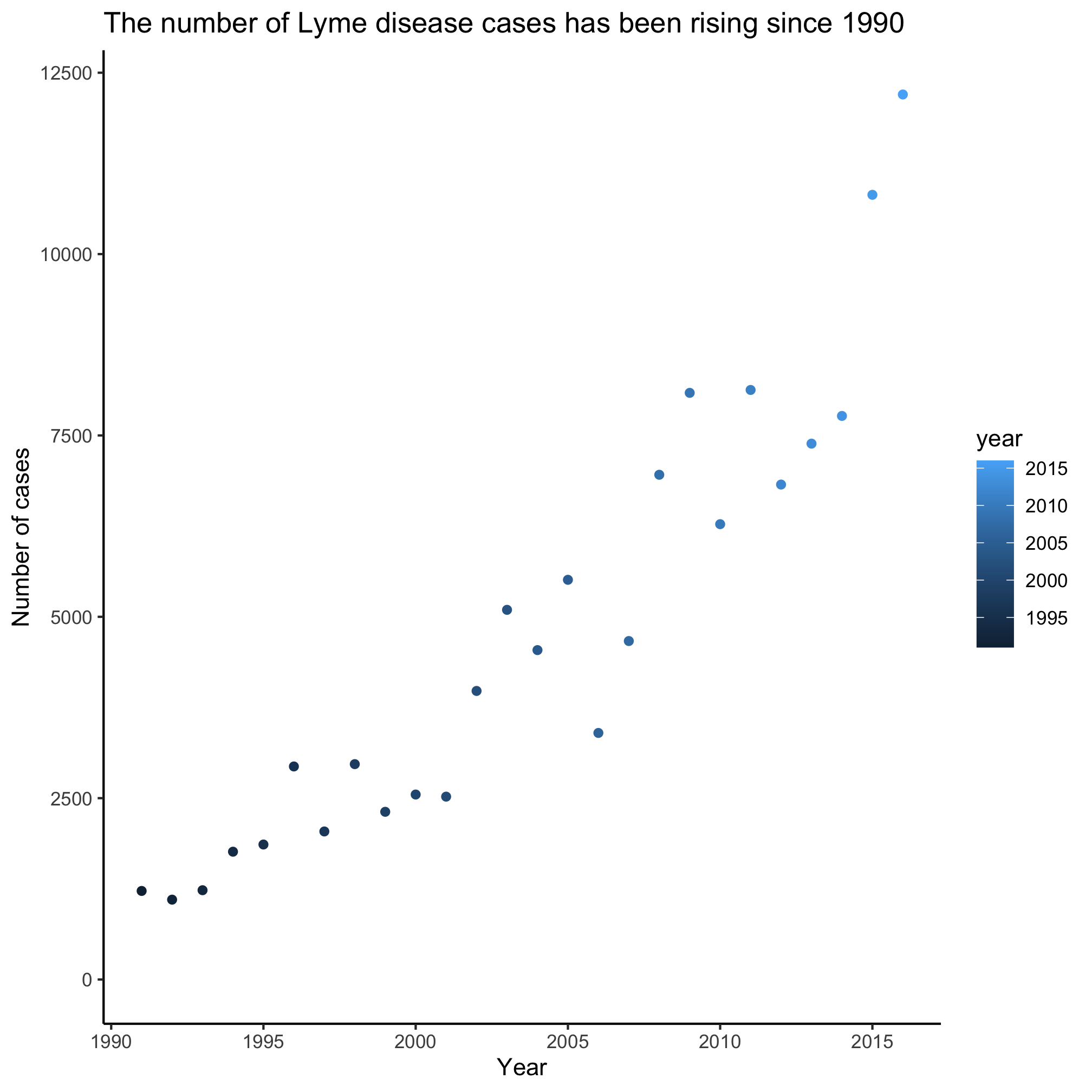
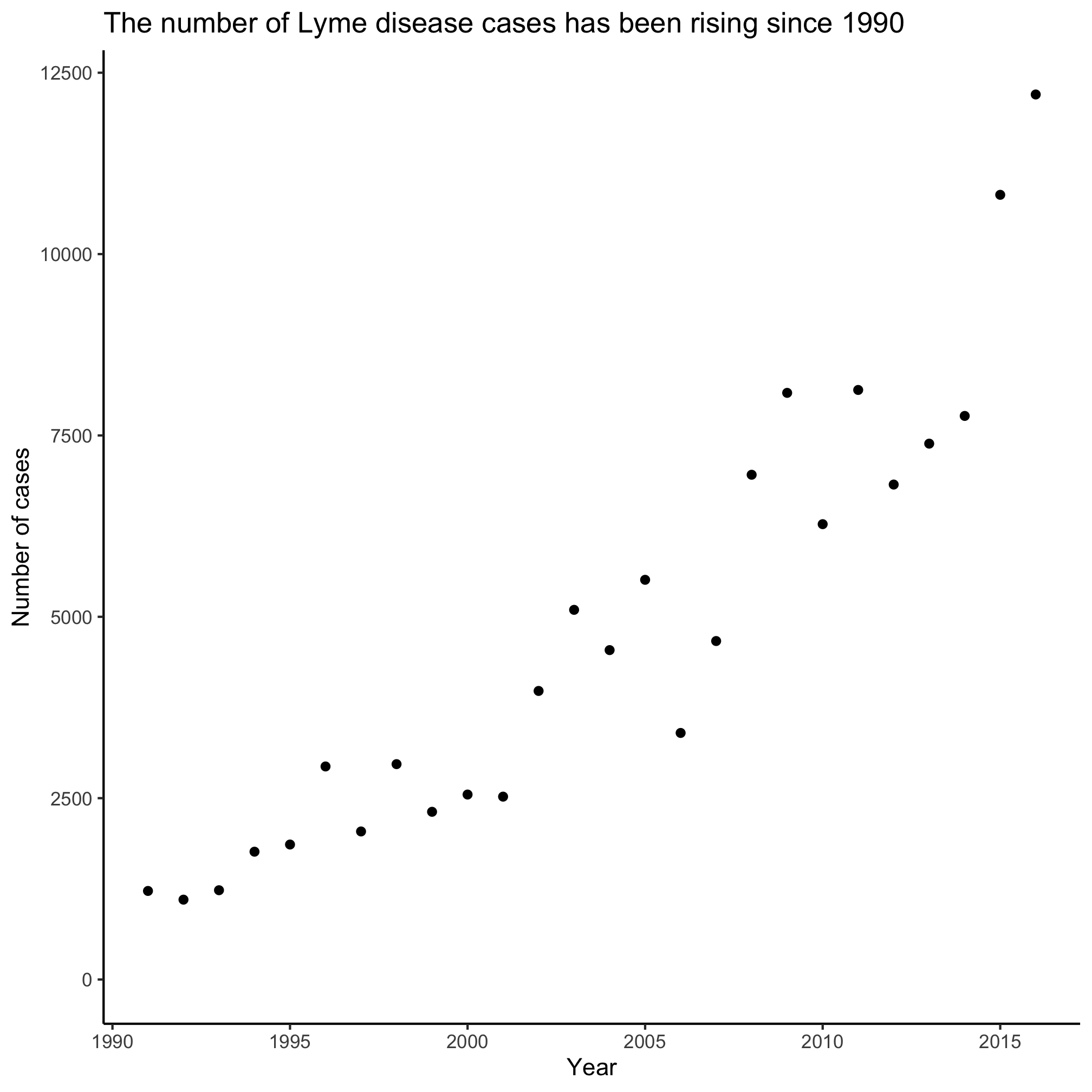
Now let’s see how we can manipulate various aesthetics about the line we are plotting with the geom_line and see if we can make a different type of plot. There are many geom’s available to us for making different types of plots. We’ve seen geom_line. Let’s try two others to make a scatter plot and a barchart
library(tidyverse)
library(lubridate)

annual_counts <- read_csv("project_tycho/US.23502006.csv",
			col_type=cols(PartOfCumulativeCountSeries = col_logical())) %>%
	filter(PartOfCumulativeCountSeries) %>%
	mutate(year = year(PeriodStartDate+7)) %>%
	group_by(year) %>%
	summarize(count = max(CountValue))


ggplot(annual_counts, aes(x=year, y=count)) +
	geom_point() +
	scale_y_continuous(limits=c(0,NA)) +
	scale_x_continuous(breaks=c(1990, 1995, 2000, 2005, 2010, 2015)) +
	labs(x="Year",
		y="Number of cases",
		title="The number of Lyme disease cases has been rising since 1990") +
	theme_classic()
ggplot(annual_counts, aes(x=year, y=count)) +
	geom_col() +
	scale_y_continuous(limits=c(0,NA)) +
	scale_x_continuous(breaks=c(1990, 1995, 2000, 2005, 2010, 2015)) +
	labs(x="Year",
		y="Number of cases",
		title="The number of Lyme disease cases has been rising since 1990") +
	theme_classic()
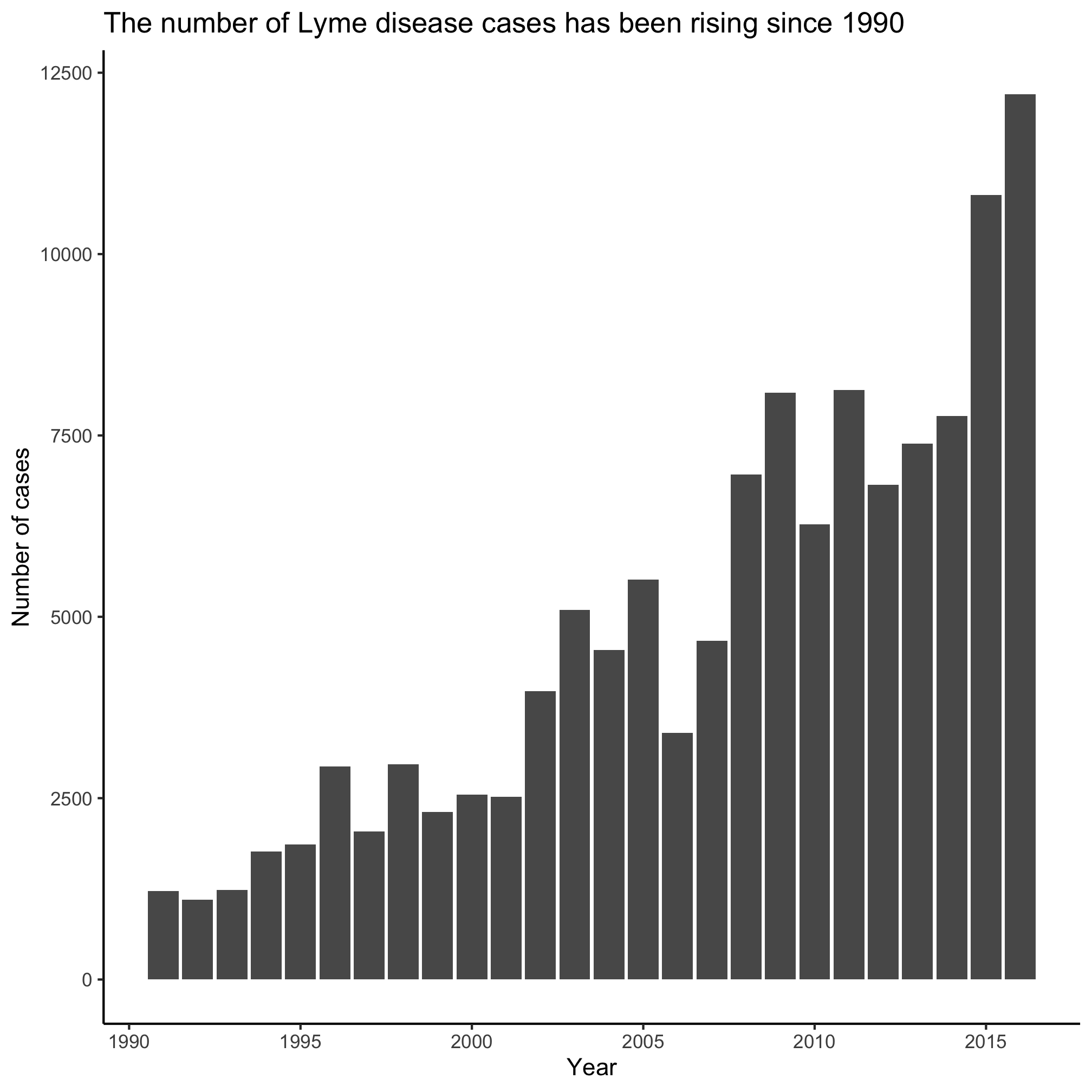
Of the three types of plots we’ve made, which do you like better? Most professional data visualization practitioners would prefer the line plot. The line connecting the points indicates continuity and it has a fairly elegant and minimalist presentation compared to a bar plot.
Aesthetics
Each geom has its own set of aesthetics that can be manipulated when we plot the data. For example, geom_line has color, linetype, size. I know this because if I use the RStudio help menu to search for geom_line or if I run ?geom_line from the R prompt, I get the help page for the function. The first thing I learn is that there are three types of line plots that I can use within the ggplot framework - geom_path, geom_line, and geom_step. These all have very similar syntax, but do slightly different things. As you scan through this help page, you will find a section called “Aesthetics” that tells you what thing can be manipulated for these commands.
Aesthetics:

     ‘geom_path()’ understands the following aesthetics (required
     aesthetics are in bold):
        • *‘x’*
        • *‘y’*
        • ‘alpha’
        • ‘colour’
        • ‘group’
        • ‘linetype’
        • ‘size’

     Learn more about setting these aesthetics in
     ‘vignette("ggplot2-specs")’.
Clearly x and y are going to be required. We’ll talk about it in a bit, but we set those in the line ggplot(annual_counts, aes(x=year, y=count)).
Let’s see how we can manipulate these aesthetics.
color
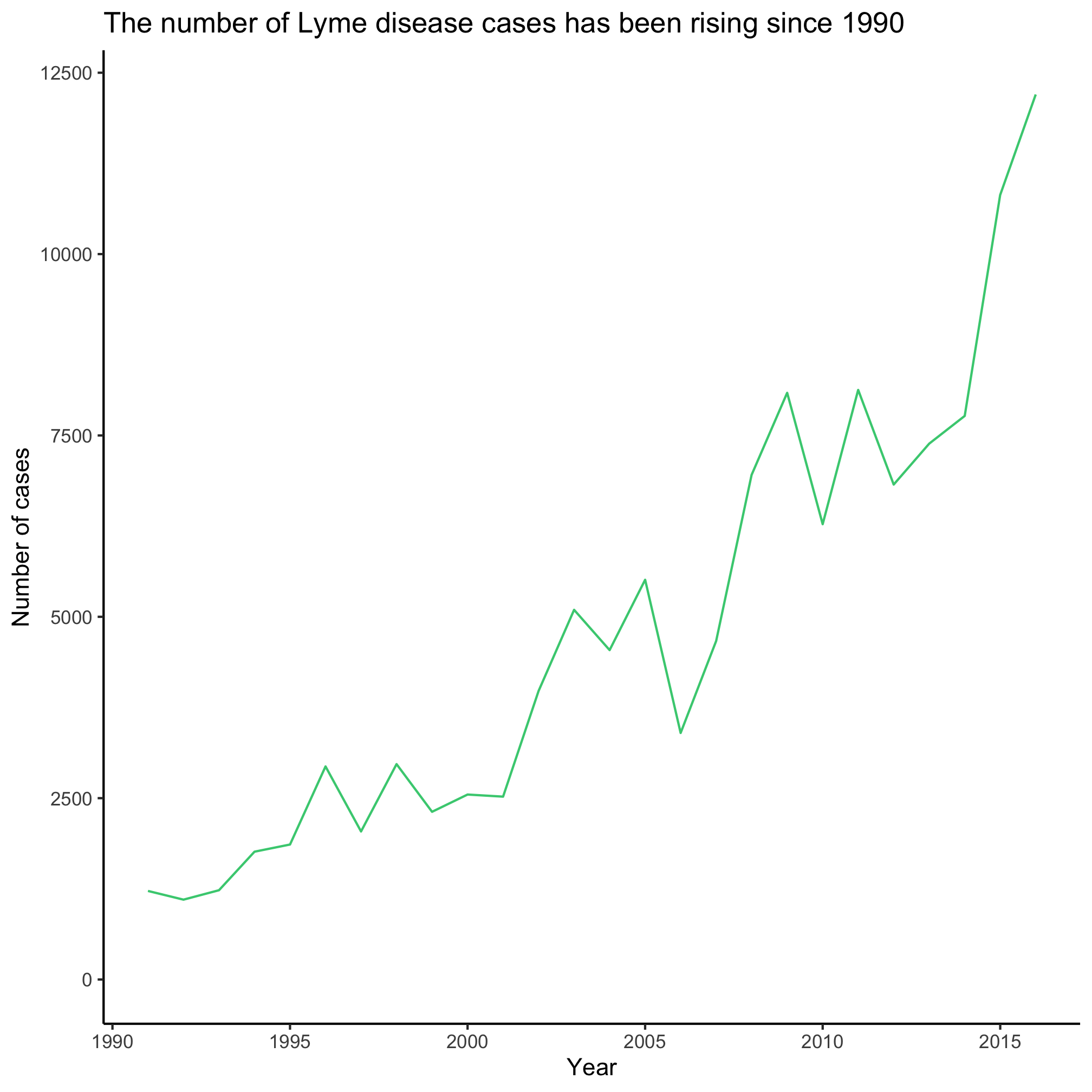
The colors() function will give you a listing of the “named” colors that are available in R. Enter colors() at the prompt in the console. Modify the code chunk below to plug in your favorite color
ggplot(annual_counts, aes(x=year, y=count)) +
	geom_line(color="seagreen3") +
	scale_y_continuous(limits=c(0,NA)) +
	scale_x_continuous(breaks=c(1990, 1995, 2000, 2005, 2010, 2015)) +
	labs(x="Year",
		y="Number of cases",
		title="The number of Lyme disease cases has been rising since 1990") +
	theme_classic()
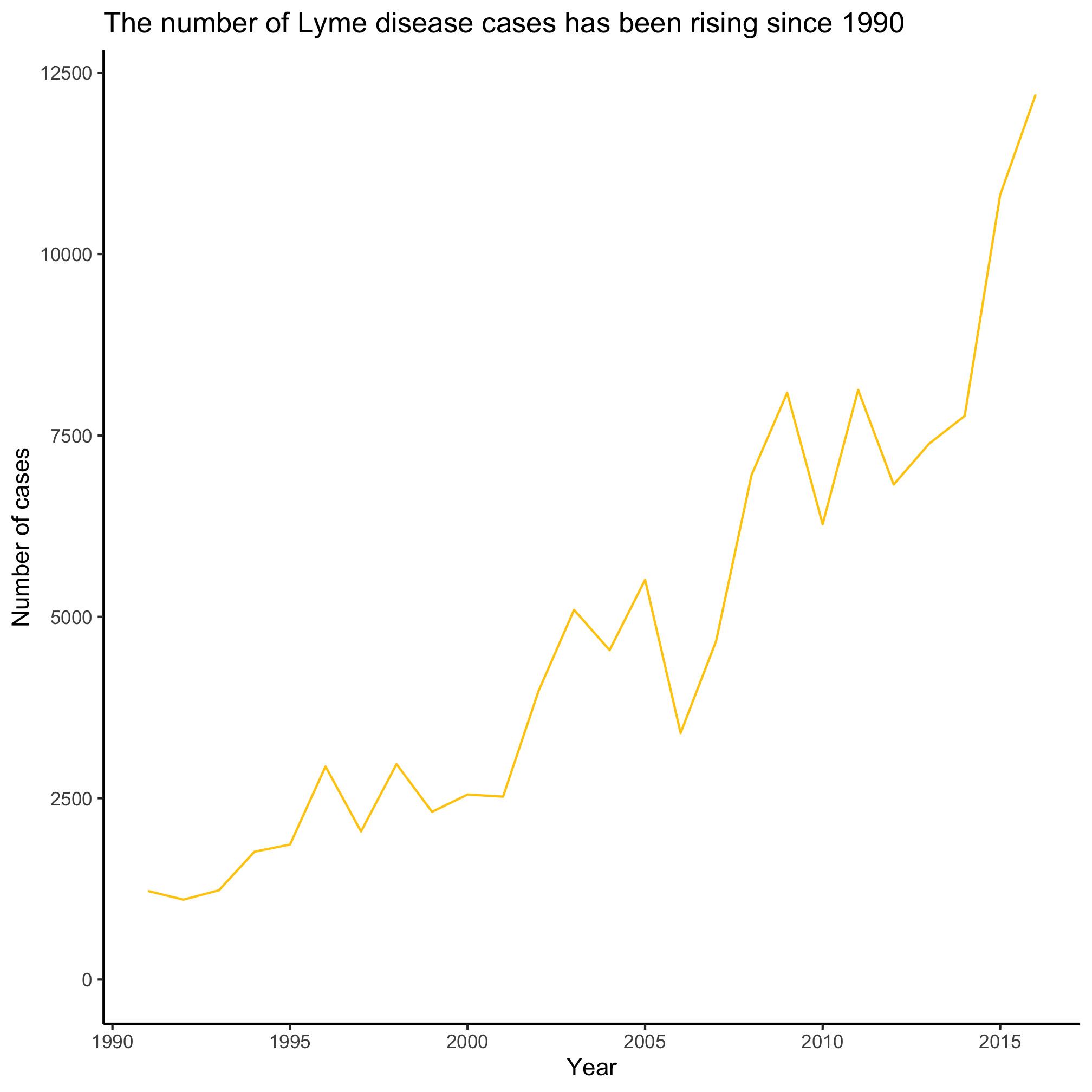
An alternative to using named colors like seagreen3 is to use the hexidecimal code for the colors you like. There are browser plugins that you can use to find the hexidecimal codes for colors on your favorite websites. For example, the maize “M” on the University of Michigan website has a hexidecimal code of #ffcb0a.
ggplot(annual_counts, aes(x=year, y=count)) +
	geom_line(color="#ffcb0a") +
	scale_y_continuous(limits=c(0,NA)) +
	scale_x_continuous(breaks=c(1990, 1995, 2000, 2005, 2010, 2015)) +
	labs(x="Year",
		y="Number of cases",
		title="The number of Lyme disease cases has been rising since 1990") +
	theme_classic()
size
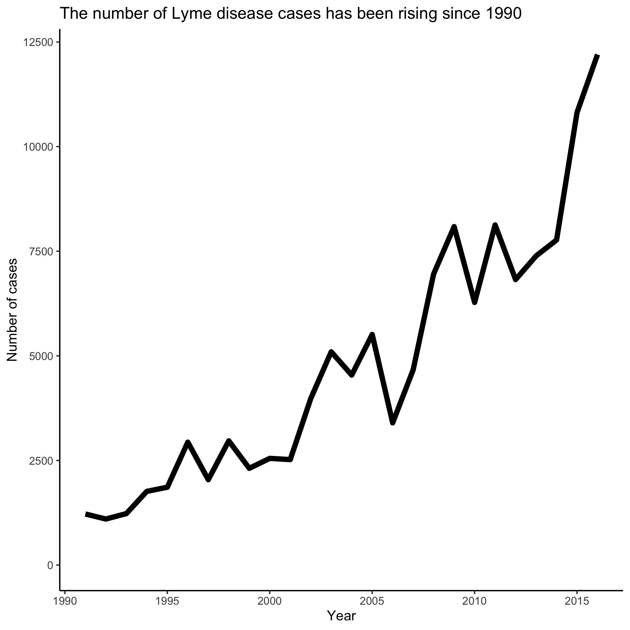
You can change the size of the plotting point or thickness of the line by setting the size aesthetic.
ggplot(annual_counts, aes(x=year, y=count)) +
	geom_line(size=2) +
	scale_y_continuous(limits=c(0,NA)) +
	scale_x_continuous(breaks=c(1990, 1995, 2000, 2005, 2010, 2015)) +
	labs(x="Year",
		y="Number of cases",
		title="The number of Lyme disease cases has been rising since 1990") +
	theme_classic()
linetype
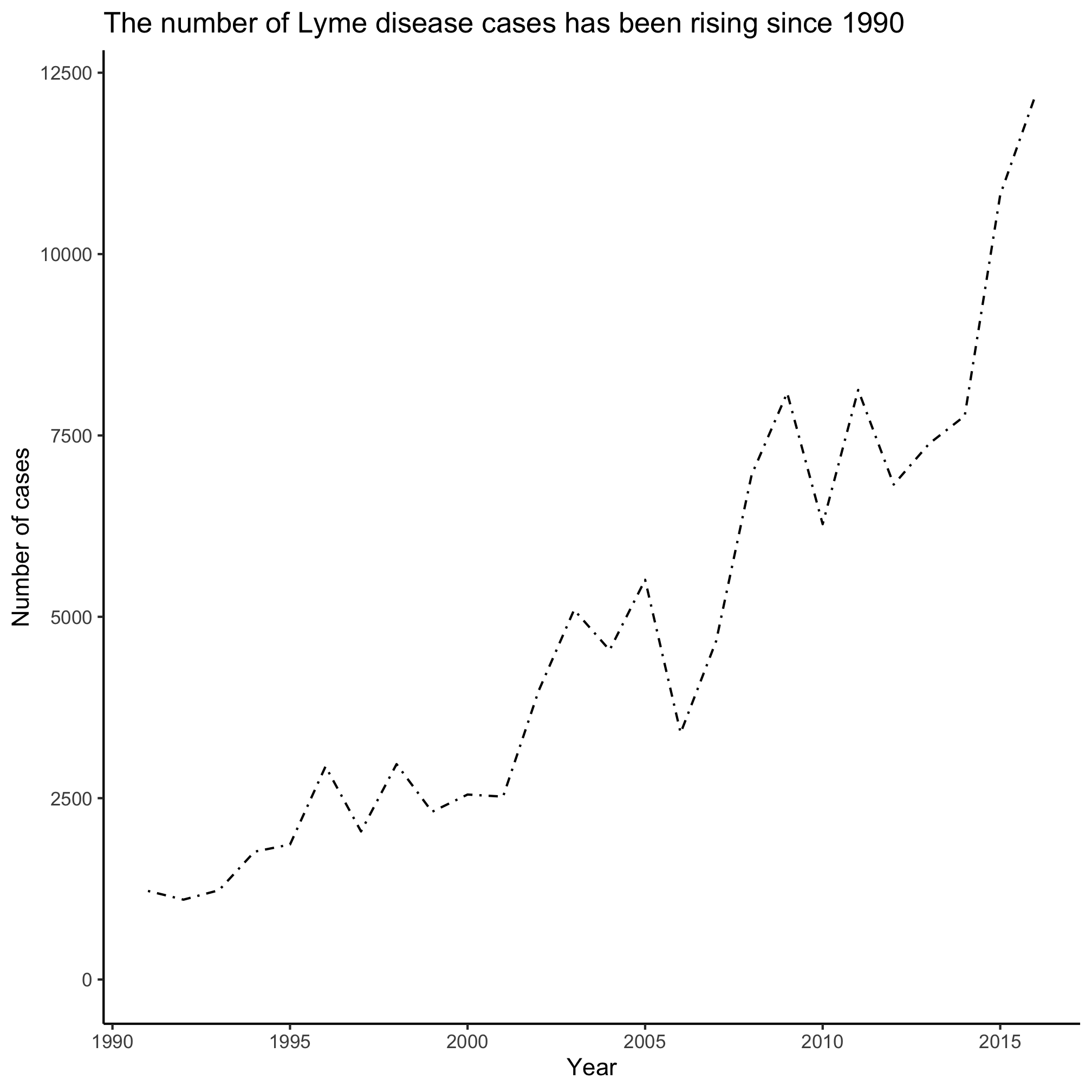
There are six different types of lines that you can use that vary in the number of dots or dashes. The default (linetype=1) is a solid line. You can try different values to get the desired hashing of the line
ggplot(annual_counts, aes(x=year, y=count)) +
	geom_line(linetype=4) +
	scale_y_continuous(limits=c(0,NA)) +
	scale_x_continuous(breaks=c(1990, 1995, 2000, 2005, 2010, 2015)) +
	labs(x="Year",
		y="Number of cases",
		title="The number of Lyme disease cases has been rising since 1990") +
	theme_classic()
symbol
There are 25 different plotting symbols in R that can be set by giving the shape argument a value from 1 to 25. I tend to limit myself to a handful of these: open and closed squares, circles, or triangles. To keep myself from hunting for the right shape value, I made a cheat sheet:
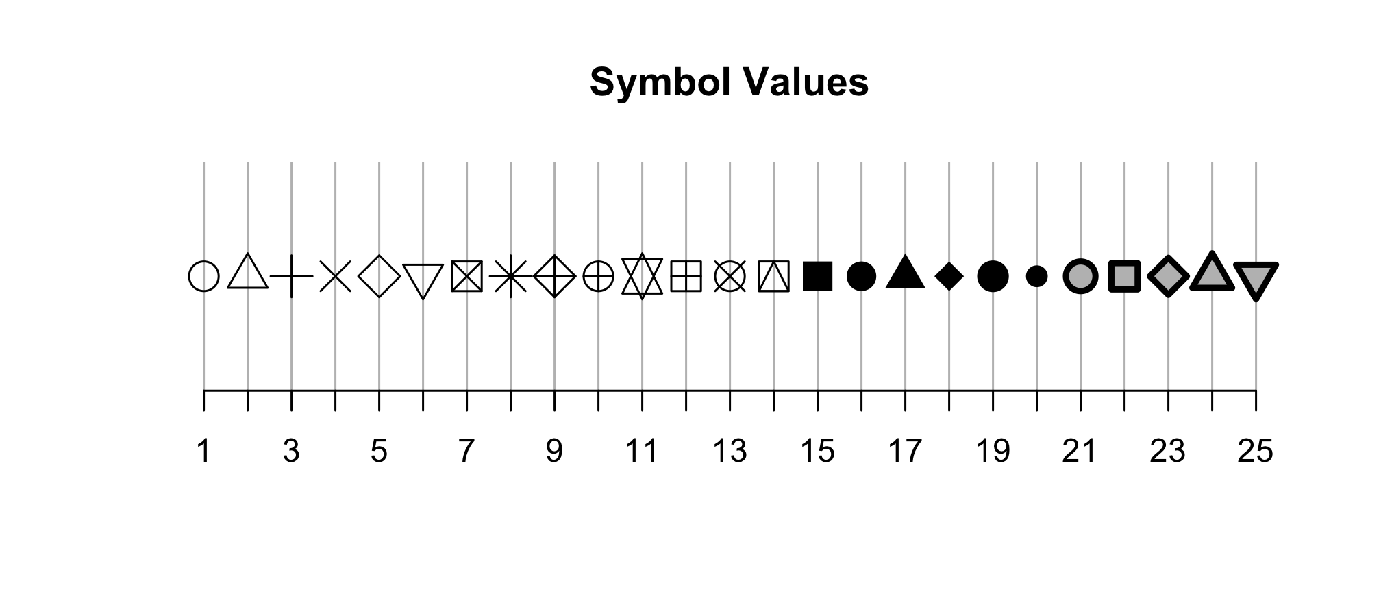
Among these 25 symbols, symbols 21 to 25 are unique. The color of these symbol is taken from the value of fill and the color of the border comes from the value of color. The width of the border can be set with the stroke aesthetic.
ggplot(annual_counts, aes(x=year, y=count)) +
	geom_point(shape=8, size=2) +
	scale_y_continuous(limits=c(0,NA)) +
	scale_x_continuous(breaks=c(1990, 1995, 2000, 2005, 2010, 2015)) +
	labs(x="Year",
		y="Number of cases",
		title="The number of Lyme disease cases has been rising since 1990") +
	theme_classic()

fill
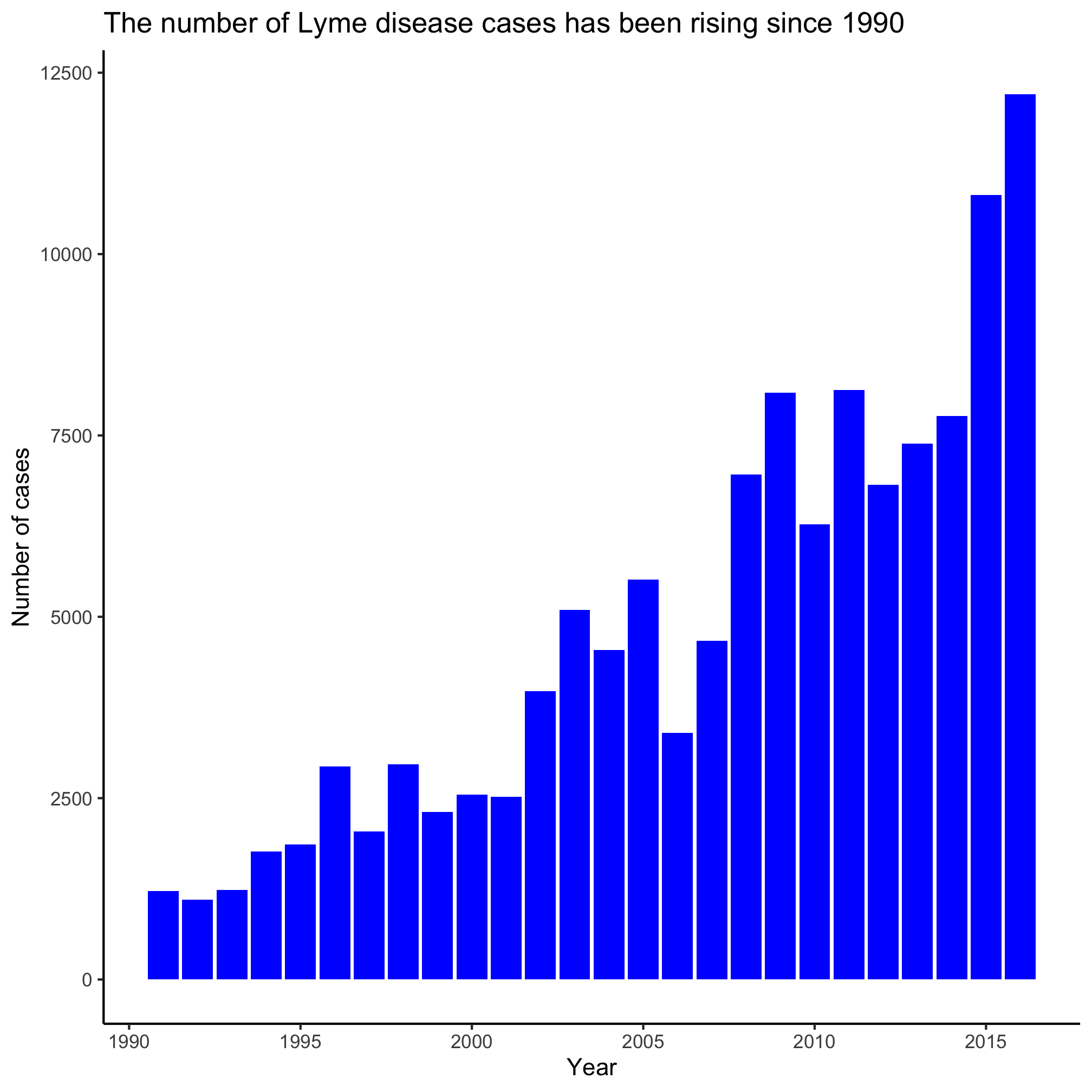
The fill aesthetic allows you to set the color of the interior of bars in a bar/column plot. I frequently accidentally use color when generating a column plot.
ggplot(annual_counts, aes(x=year, y=count)) +
	geom_col(fill="blue") +
	scale_y_continuous(limits=c(0,NA)) +
	scale_x_continuous(breaks=c(1990, 1995, 2000, 2005, 2010, 2015)) +
	labs(x="Year",
		y="Number of cases",
		title="The number of Lyme disease cases has been rising since 1990") +
	theme_classic()
Mapping aesthetics to our data
We have been putting the aesthetic and its value in the parentheses for the geom_ function. When we do that, the value is applied to all of the points. For example, in the last example showing fill, all of the bars were the same color. Often, we want the aesthetic value to vary by something in our data frame. Recall that x and y are aesthetics. Can you see how we might make each year’s bar a different color?
ggplot(annual_counts, aes(x=year, y=count, fill=year)) +
	geom_col() +
	scale_y_continuous(limits=c(0,NA)) +
	scale_x_continuous(breaks=c(1990, 1995, 2000, 2005, 2010, 2015)) +
	labs(x="Year",
		y="Number of cases",
		title="The number of Lyme disease cases has been rising since 1990") +
	theme_classic()
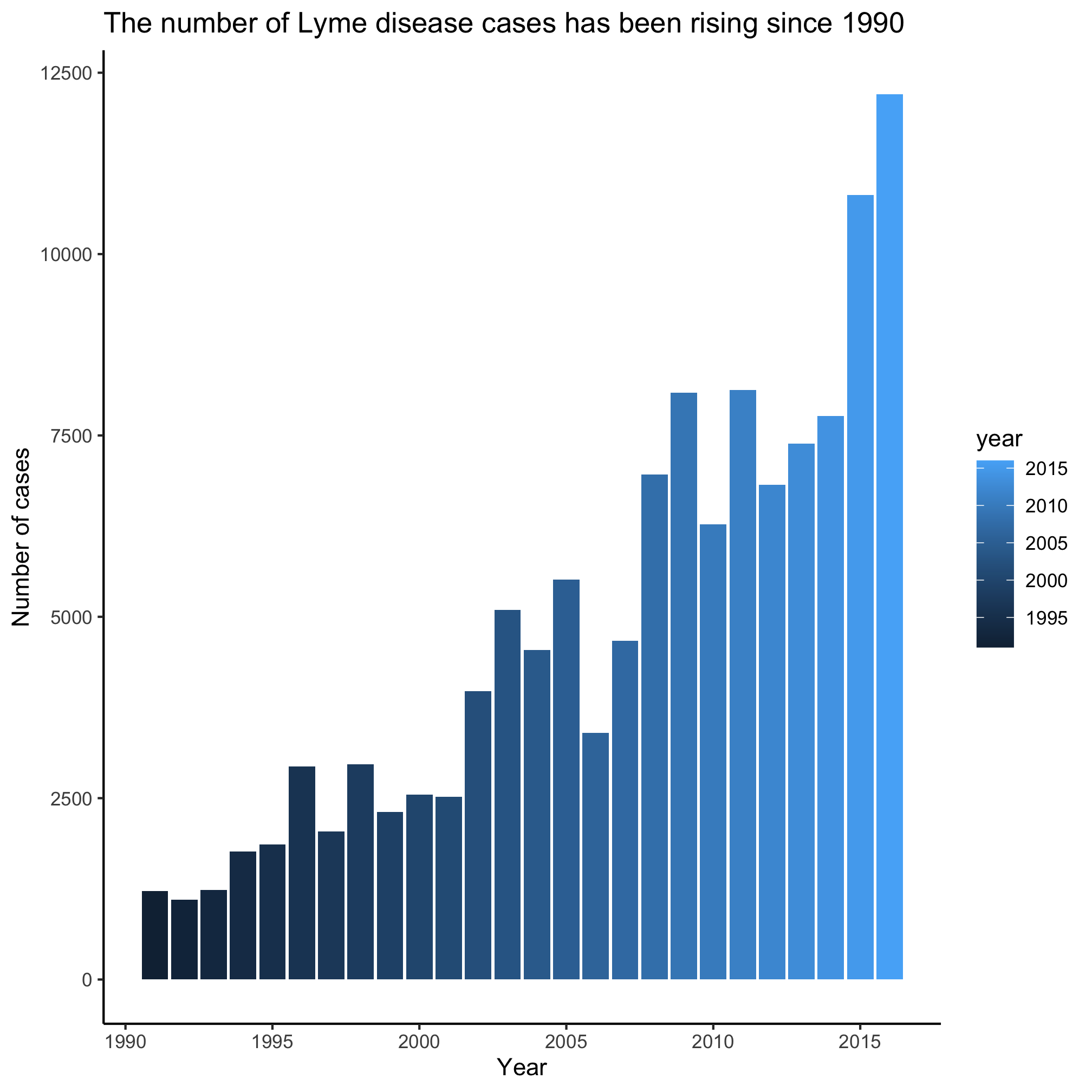
You’ll note that we removed fill="blue" from geom_col() and put fill=year into the aes function within the ggplot function call. In this example, year is a continuous variable so we get a gradient of blues. Later we’ll see how this changes when the variable is a categorical variable.
Exercises
1. What aesthetic values are available for use with geom_point and geom_col?
2. Can you see a difference between geom_line, geom_path, and geom_step? Why might you not see a difference between the output for geom_line and geom_path?
3. What does alpha do? Can you imagine a time that it might be useful to use?
4. What happens if we use color="blue" rather than fill="blue" as a geom_col argument? Try using both arguments, but so that color and fill have different values
5. What happens when you try to map the year to the shape aesthetic when using geom_point? Can you find another aesthetic to map to the year that will work?
